


The U.S. Housing Market is a Hot Mess

First I Must Vent
The only thing I expect these days is extreme entitlement and grift, which is basically the entire real estate industry.
We have more homes per capita than ever, yet people like Dave Ramsey still claim prices are so high because there’s a “housing shortage” that he can’t even define or quantify.

Hope this clears things up………..

We’re just propping up the wealth effect at the expense of everything else- quit being naive.
Ok now I feel better!
In other news…….
The Average Household Size Stopped Declining in 2024
Tried to warn you…
If you were paying attention, you would’ve realized 2 person households outright contracted in 2024, which hasn’t happened in decades….
That’s a problem, because the entire bull thesis in housing essentially relies on 1 and 2 person household growth; and that cohort now accounts for roughly 65% of all households.
Now you see it:

Now in the aggregate

The irony is people are so brain dead these days, they’re actually bullish on real estate based on the average household size falling. Do you understand just how insane that is?! If the average household size continues to fall- and by extension small household growth continues unabated (which it’s not)- we have much larger issues on our hands. As in birth rates are going to zero and our population trends mimic something closer to what Japan is experiencing. We’re headed in that direction inevitably.
Let’s remember how this works- household growth is no longer meaningfully outpacing population growth as was the case from the late 60s through the mid to late 80s for a myriad of reasons I’ve already mentioned. At this point, it’s merely a function of old age and/or affluence; and now more than ever, it’s heavily reliant on easy money.
So the reason housing units per capita has been rangebound for decades is because households can only get so small in size, especially in the near term. Fewer people per home equates to fewer potential incomes for a given dwelling. And that creates problems when home prices have outpaced incomes, which is where we are now.
Since these numbers were updated for 2024 earlier this month at a national level, figured I’d share the visual below again, which as I already mentioned shows that the average household size did NOT decline in 2024.
Who could’ve seen this coming?!

Remember that the demographic backdrop looks absolutely NOTHING like the 70s/80s. Women are already in the workforce- dual income households have been around for decades.
So incomes will not catch up to home prices in the face of a softening labor market- only an ace face would suggest otherwise.
Quality Growth is Nonexistent
So whether it’s the labor, population, spending, or even household data- we have a serious quality growth problem on our hands.
That’s why it’s important to pay attention to household growth and how it’s changed over time to see where we go from here.
And I know I’ve hit on several of these themes before, but since we’re going a bit deeper today, a quick refresher is in order:
Recall that the U.S. is still predominantly a family household country; and families have a minimum size of 2 people. Nonfamilies- which represent approximately 36% of all households regardless of tenure/occupancy (OO/RO)- are typically just one person living alone (over 80% of them). So if someone is living alone, they are by definition a nonfamily household. And these 1 person households are a very weak link in this entire equation.
I would hope by now it’s somewhat clear that the household data is cut a variety of ways. And these iterations add a truckload of value in making sense of what’s actually transpiring in the housing market.
Case in point- the below visual, which cuts occupied homes, 2 ways, by:
Household type and age; as well as
Household type and tenure
Full disclosure- these next couple of visuals which are stacked barcharts (shown as level & Y/Y) may appear to be busy, but they’re set up intentionally to convey as much information as possible. To save room, the legend for each respective, similarly colored chart is at left.
And pay close attention to the color scheme especially by age which is separated into 3 main groups:
Under 25 (blue)
25-54 (green): prime working age
55+ (grey)
Here’s what I see below:
Family households of all sizes are more often than not homeowners vs renters. Should be somewhat intuitive. Said another way, nonfamily households are much more common amongst renter households, which is why they tend to be smaller in size in terms of headcount than homeowners.
Household growth- across all occupancy types and tenures- is broadly slowing in the aggregate compared to the COVID peak.
In 2024, more family households opted to rent, which is a fairly new trend we haven’t seen since 2021. Maybe they finally listened to some of us suggesting it’s better to rent than own right now!
Nonfamily household growth across all tentures (OO and RO) and size is bias- but not limited- to old age in the near term.

Your head hurt yet? Stick with me now- digging a bit deeper

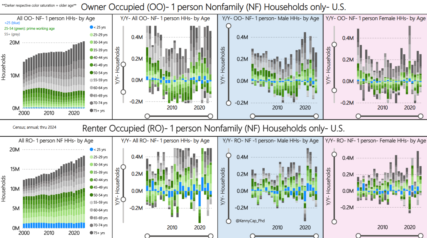
Now I’m going to isolate for 1 person/nonfamilies because again they account for over 80% of all households of this type. Remember- they are a very weak link in this entire equation. When you cut these solo households further- by tenure, age, and even sex- that’s where things get interesting.
Like I said previously, 1 person household growth has not been exclusively limited to old age groups as implied by broader nonfamily trends, especially after COVID.
What becomes clear is starting around 2015, many younger adults went full bachelor/bachelorette mode and were buying homes or renting their own place, which only makes sense given where we were in the business cycle at the time.
But even after COVID, there was significant growth in young, 1 person households that was bias to males (blue background) on the homeownership side. That trend has fallen sharply from 2023-24. Prime working age homeowner females (pink background) faired marginally better over the most recent year.
One person household growth on the renter side is still fairly strong across all ages and sexes, which might sound like a positive thing. But it’s not a rosy picture when you start comparing rents to incomes across the country. More on that later.
**Note that I have zoomed in on the Y/Y charts below to ensure equal scaling and to make those trends easier to see. First 2 charts for both OO and RO below with a white background do not make a distinction for sex.***
So we’ve had a lot of 1 person household growth around and after COVID, but as I just illustrated, it’s not all due to old age. And that may sound like a good thing, but it’s not once you start looking at incomes across various age groups.
As the visual below illustrates, renters on a relative basis are the ones getting run over the most when it comes to shelter costs since they are subject to market rates. And new homebuyers financing their purchase, broadly speaking.
Now understand there is a demographic component as to why the stock of homeowners without mortgages has increased over time (now ~40%). We are just older as a country and the 55+ crowd now accounts for ~55% of all homeowners. So the affordability problem isn’t apparent to many homeowners because not everyone experiences housing costs equally- duh! And these trends represent policy choices that have essentially pumped housing costs well beyond what households can reasonably afford.
So this idea that we’re experiencing an income driven expansion is the dumbest thing I’ve ever heard. If that were the case, you wouldn’t see a surge in severely cost burdened households of both renters and homeowners post COVID!
***Note: the darker respective color saturation means greater monthly costs go towards some version of shelter costs, whether renting or owning. Y/Y up top; level/share below***

Plus you wouldn’t see mortgage originations with DTIs well into the mid 40s and even higher over the past few years if incomes were actually keeping up. That’s even true in my hometown of Nashville; and many of these borrowers are quite young- and small in household size as you’ll see shortly- which is only logical since our population is still younger in the aggregate.
Yep, I just said that.
And younger markets usually have a higher employment population ratio too, which might matter just a little bit.
Young & Small Households are Bad News
That’s especially true of people living alone, because the entire household’s income rides on one individual, obviously.
But wouldn’t it be nice to know if there are a lot of 1 person households- both owners and renters- where you live? Better yet, how it’s changed over time. Maybe their age. Even how it stacks up to say other markets. Well the answer is you can get a decent idea of those things at a local level.
So I’ll just use my hometown of Nashville/Davidson county, TN as an example. Because we have a low homeownership rate locally, one could reasonably expect nonfamily households to be more prevalent than they are at a national level (~36% across both OO and RO). Well if that was your intuition, then you guessed right- it’s closer to 50% here- yep, that’s right. And the irony is that nonfamily households are over represented for both homeowners and renters- it’s around 37% of all OO (~28% nationally); closer to 60% of all RO- again larger than the national reading of ~50%.
So Nashville has a very high concentration of nonfamily owner and renter households. But the question is how has that changed.
Again- back to the visuals. So below I’ve set up some charts for Davidson county that get into the weeds. Broadly speaking, the various shades of red are renters. Blue are homeowners.
Total Households- by Tenure and Type
What the first column in the visual below shows is total households/occupied homes by tenure (OO & RO) and type (F= Family; NF= Nonfamily), 3 ways:
Level
Y/Y; and
% Share
The dotted yellow line on the bottom (% share) chart is just telling you that Davidson county has a lower home ownership rate than the national average, as I previously discussed.
Nonfamily Households- Living vs not Living Alone
The second column of data shows NONFAMILY- LIVING ALONE vs NOT LIVING ALONE in isolation- by tenure. So by tenure, Nashville has just slightly less nonfamily households living alone compared to the national average. It’s a little more in line for nonfamily homeowners.
But it’s important to note that again we are just looking at NONFAMILY ONLY- LIVING vs NOT LIVING ALONE. Since I already pointed out that Nashville has a larger share of nonfamily renters and homeowners in the aggregate compared to the national average, Nashville still registers as having above average 1 person households across both OO and RO. Don’t get it twisted!
Nonfamily- Living Alone- by Age
The third column is where we hit paydirt. Again- isolating for just nonfamily households, but now LIVING ALONE- BY AGE & TENURE . As you can see, Nashville has a much higher share of 15-34 year olds living alone, which is the cohort the yellow line is benchmarking. Obviously it’s much more pronounced on the renter side of the equation (~43% vs ~28% nationally) . But it’s still elevated for young homeowners (~15% vs ~7.5% nationally) which has seen noteable growth over the past few years.

Now before I get unfairly accused of misrepresenting things and zeroing in on small households, below is what the stock looks like over time across all iterations of homeowners by type, age, and size.
Say it with me- families have a minimum size of 2. Families have a minimum size of 2.
**OO = Owner Occupied**

Remember what I said from the beginning- 1 person household growth even on the homeownership side has NOT been driven exclusively by old age. That’s true at a national level, and for my hometown of Nashville.
Again- sounds like a good thing, but not in practice. Really what’s happened is easy lending standards have suckered a lot of recent homebuyers into pulling mortgages on homes they’ll struggle to pay for.
Did you know nonfamily incomes are much lower than family household incomes in Nashville? And did you know you can actually observe the share of homeowners with and without mortgages by age here in town?
So home prices are already way too high. And last I checked incomes scale with age-remember what I said about local DTIs…
Now who in their right mind thought it was a good idea to:
Raise rents and qualify households of all shapes and sizes for homes they literally can’t afford
In the face of a softening labor market
With record, structural supply
Oh yeah- it’s the guy whose salary depends on it!
I’m sure there’s no reason things like delinquencies are picking up and evictions are well above their pre covid trend in Nashville if households are perfectly fine, right?!
Greatest. Hand Holding. Economy. Ever.

And if you know me, I’m not a fan of generic, blanket statements.
I wasn’t kidding when I said Nashville has FAR TOO MANY homes. Davidson county has a lower than average homeownership rate which was the case even back in the 70s; and generally speaking, vacancies have been fairly in line with national trends. So nothing explains this absurd move higher in homes per capita other than free money.
Ohhhhh the irony!

So I’d be very cautious of anyone who willingly ignores household/demographic trends or doesn’t consider them timely because they are a valuable tool that help paint a more complete picture, especially when paired with other datasets. And they can clue you in on markets that may struggle sooner- and possibly more- than others.
That’s why I keep harping on these markets that have both small and young households, which just so happens to be the case in my hometown. Combined with things like trends in permitting, migration, originations, job prospects, obviously real estate sales etc- it was somewhat obvious Nashville would struggle, likely sooner than many cities.
Way I see it- this is nothing more than an information access issue.
Remember, there isn’t a single market anywhere in the country that is somehow immune from the rate hiking cycle- it’s just a matter of how much and when they’re impacted based on each area’s unique profile.
Time to take the blinders off.
Ok- that’s all I got!
-Kenny

A Few Bonus Charts
Speaking of the labor market- slice the data however you want-nationally, locally- it all points to a slowdown. Heck, even the various State and MSA diffusion indexes which measure the dispersion in employment change are showing undeniable weakness.


If anything, the above is overly optimistic because NFP captures government jobs, which have experienced above trend growth post COVID, especially at the state and local level (ex education).
The national employment report actually produces a diffusion index for the private sector as well as manufacturing- do you see the problem?

Even when the permitting is normalized and compared to other markets, Nashville has overbuilt. There I said it.

This post is a masterclass in demographics and housing… opened an entire new dimension to me. 👏👏👏 Thank you
Absolutely incredible. Thank you so, so much.